• Home
  • Accent
  • Brussels Airlines
  • srprs.me
  • Lotto
  • Passa Porta
  • Mort Subite
  • PCC
  • Lobster
  • Belga
  • TLmag
  • Bulletin
  • Contact
Accent Brussels Airlines srprs.me Passa Porta Mort Subite PCC Lobster TLmag
Accent Image 1
Accent Job: Custom Typeface
Client: Today
Art direction: Today

Working alongside creative agency Today, I played a key role in refining the visual identity for recruitment firm Accent.

My focus was on customizing the Avenir typeface to create a bespoke solution that would be consistently applied across all brand touchpoints from large-scale billboards to digital platforms.

This custom typeface brought a unified and refreshing look, greatly improving the cohesion and impact of Accent's identity wherever it appeared.

Accent Image 2
Accent Image 2
Accent Image 3
Brussels Airlines
Brussels Airlines Job: Letter design
Client: Today
Art direction: Today

Working in conjunction with Today agency, I was asked to enhance the Brussels Airlines wordmark, focusing specifically on the design of its letterforms.

Through careful refinement, I helped create a more coherent and impactful logotype. This updated wordmark now serves as a strong, unified visual element across all Brussels Airlines touchpoints, from their fleet to their extensive advertising efforts.

Brussels Airlines
Brussels Airlines
srprs.me
SRPRS.ME Job: Custom Typeface
Client: Today
Art direction: Today

In collaboration with Today agency, I customized the typeface for SRPRS.ME, an innovative travel agency targeting a young, adventurous audience.

The goal was to imbue their brand identity with a sense of excitement and surprise. Through strategic randomization of rounded edges, the typeface visually communicates the thrill of unexpected journeys.

This custom font is integral to their brand, used extensively across all web media to engage their dynamic clientele.

srprs.me Image 2
srprs.me Image 3
srprs.me Image 4
Lotto Image 1
Loterie Nationale Job: Custom Typeface
Client: Today
Art direction: Today

Working with creative agency Today, I was responsible for customizing the typeface for Loterie Nationale de Belgique.

A key aspect of this project was to establish a clear and effective visual dialogue between their iconic logo and the supporting typography.

The design decisions on the letterforms ensured a unified and impactful brand presence, where the typeface perfectly complemented and amplified the recognition of the Lotto's logo.

Lotto Image 2
Lotto Image 3
Passa Porta Image 1
Passa Porta Job: Visual Identity Implementation
Client: La Villa Hermosa
Art direction: La Villa Hermosa

For the Passa Porta Festival, I collaborated with agency La Villa Hermosa to apply the festival's visual identity across all key touchpoints.

My role involved ensuring consistent and impactful design execution on everything from the festival program and flyers to the website and posters.

This comprehensive application helped to create a unified and recognizable brand experience for attendees throughout the event.

Passa Porta Image 2
Passa Porta Image 3
Passa Porta Image 4
Mort Subite Beers
Mort Subite Job: Packaging
Client: Alken Maes
Art direction: Bowling

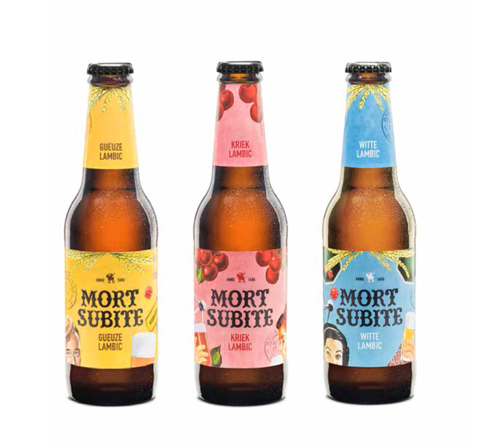
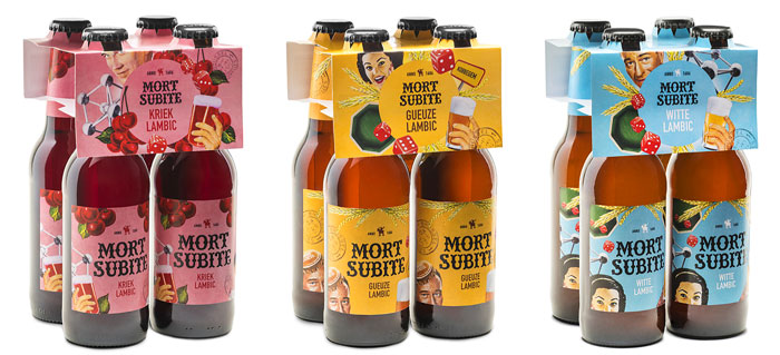
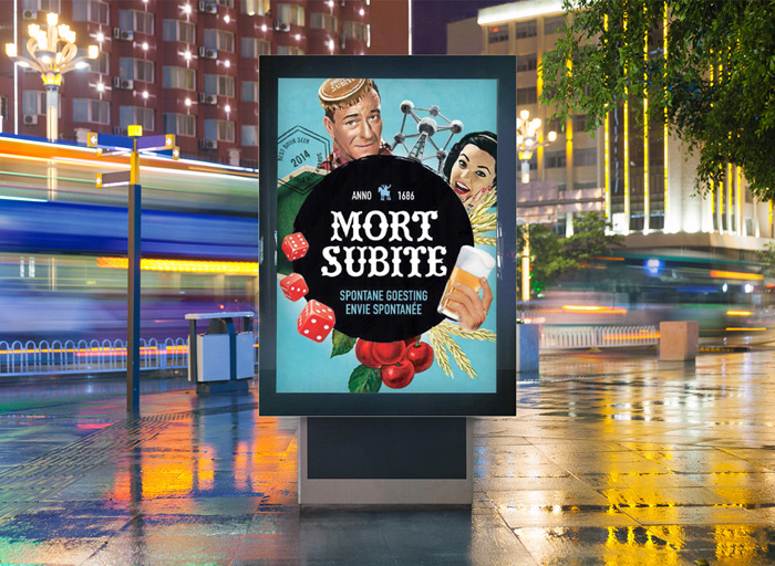
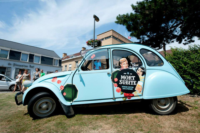
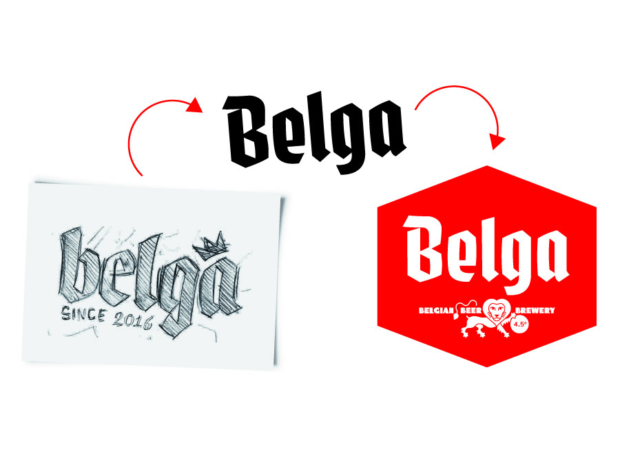
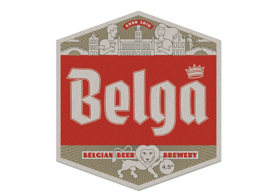
Working with creative agency Bowling, I played a key role in the rebranding of Mort Subite, an iconic Belgian beer. This extensive project emphasized the brand's deep heritage, prominently featuring retro illustrations and the reintroduction of its historical wordmark.

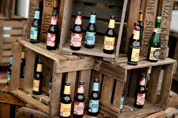
A critical design element was the application of bold and vibrant colors to effectively distinguish between the different beer varieties.

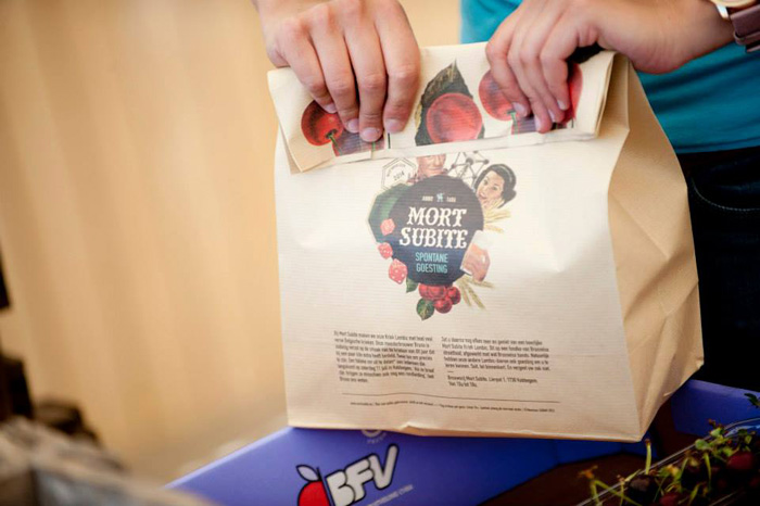
My design efforts covered a wide array of brand materials, including beer bottle labels, packaging, billboards, beer glasses, and serving trays, ensuring a consistent, distinctive, and appealing brand experience.

Mort Subite fourpack
Mort Subite poster
Mort Subite cases
Mort Subite feest 1
Mort Subite feest 2
PCC Image 1
PCC Job: Webdesign
Client: Point Contact Culture
Art direction: Sebastien Sanfilippo

For Point Contact Culture (PCC), I contributed to the redesign of their website, transforming it into a central hub and touchpoint for all PCC activities and its members.

The primary goal was to editorially showcase the diverse cultural events PCC helped finance.

A key design feature was the implementation of a bold, custom-made font and a striking two-color system, creating a dynamic and engaging visual experience that highlights the vibrancy of the cultural sector.

PCC Image 2
PCC Image 3
Lobster Image 1
Lobster Job: Bespoke Typeface
Client: Lobster
Art direction: Lobster

For Lobster, an Antwerp-based graphic design and art direction duo, I designed a custom typeface for their personal identity.

The goal was to encapsulate their cutting-edge creative sensibility.

The resulting font is quirky yet bold, with a moody and unique character, perfectly reflecting Lobster's distinctive artistic vision.

Lobster Image 2
Lobster Image 3
Lobster Image 4
Belga Image 1
Belga Job: Logo Design & Brand Identity
Client: Happiness
Art direction: Happiness

In collaboration with Happiness agency, I designed the logo for Belga Belgian Beer Brewery, based in Vietnam.

The core challenge was to infuse the brand with authentic Belgian beer heritage while appealing to a contemporary audience. This was achieved by referencing typical gothic lettering, but reimagined with a distinct contemporary twist.

The resulting logo elegantly blends tradition with modernity, establishing a unique and memorable identity for Belga in the Vietnamese market.

Belga GIF
Belga Image 2
TLmag Image 1
TL Magazine Job: Art Direction & Layout Design
Client: Promateria
Art direction: Sebastien Sanfilippo

Present at its inception, I played a pivotal role in the art direction and layout design for TL Magazine, a bi-monthly publication dedicated to art and design.

My involvement extended beyond visual execution, as I helped create the magazine's core visual identity and establish its editorial design principles.

This foundational work ensured a cohesive, sophisticated, and engaging aesthetic that defined TL Magazine's unique voice from its very first issue.

TLmag Image 2
TLmag Image 3
TLmag Image 4
TLmag Image 5
TLmag Image 6
TLmag Image 7
Bulletin Image 1
The Bulletin Job: Editorial rebrand
Client: Base Design
Art direction: Base Design

Working with Base Design Agency, I played a significant role in establishing the new editorial design for The Bulletin magazine, catering specifically to the expat community.

We developed a sophisticated aesthetic, inspired by leading weekly magazines, to create a fresh and authoritative voice.

This involved a deliberate focus on clean white space, effective use of negative space, bold and clear titles, and the integration of captivating contemporary photography, transforming The Bulletin into a visually dynamic and highly accessible publication.

Bulletin Image 2
Bulletin Image 3